How to use Elementor custom CSS without breaking your site
 Alipio Gabriel
·
·
5 min read
Alipio Gabriel
·
·
5 min read
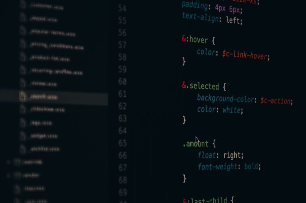
Elementor Pro gives you three separate places to write custom CSS, and most people use all three interchangeably, which is exactly how you end up with styles that only work on Tuesday. Knowing which field to reach for, and why, makes the difference between maintainable code and a site that fights you every time you need to change something.
The three CSS entry points in Elementor Pro
Elementor Pro surfaces custom CSS at three levels: the individual widget, the section or container, and the global site stylesheet under Elementor > Custom CSS. They cascade in that order, which matters.
Widget-level CSS lives inside the Advanced tab of any element. Elementor scopes it automatically with a selector like .elementor-element-abc123, so you write the rule relative to that element. Section-level CSS works the same way, scoped to the section or container wrapper. The global stylesheet under the site settings panel behaves like a plain CSS file: no automatic scoping, full control, full responsibility.
The free version of Elementor does not include the per-widget and per-section CSS fields. Those are Elementor Pro features. If you are on the free tier, your only option is the Elementor > Custom CSS panel, or a separate plugin like Simple Custom CSS.
Where things go wrong on real builds
The most common mistake we see when we take over a site is CSS written at the wrong level. Someone needed a one-off tweak to a button inside a section, so they dropped the rule into the global stylesheet with a brittle class like .elementor-button. Three months later that rule is bleeding onto every button on the site and nobody remembers why.
The second mistake is specificity wars. Elementor generates its own CSS with fairly high specificity. When your custom rule does not win the cascade, the temptation is to add !important. Once you do that once, you tend to do it everywhere, and now you have a stylesheet that is essentially shouting at itself.
A cleaner approach: write the rule at the widget or section level where Elementor gives you the scoped selector for free, keep specificity low, and only escalate to the global stylesheet for truly site-wide patterns like typography overrides or utility classes you use everywhere. On a custom WordPress build we always audit the existing CSS before adding anything new, because untangling 200 lines of !important mid-project is not a good time.
Responsive CSS inside Elementor
Elementor has its own responsive controls for spacing, font size, and visibility. Use those first. Custom CSS does not automatically respond to Elementor’s breakpoint settings, so if you write font-size: 48px in a widget’s CSS field, it will be 48px on mobile too unless you wrap it in a media query yourself.
When you do need a media query inside Elementor’s CSS fields, write it the normal way. Elementor will pass it through as-is. Just be aware that Elementor’s default breakpoints are 1024px for tablet and 767px for mobile, so align your queries to match or you will get gaps between what the builder controls and what your CSS controls.
For anything more complex than a handful of responsive tweaks, we move the CSS into a child theme’s style.css or a dedicated custom stylesheet enqueued properly. The Elementor custom CSS fields are convenient; they are not a replacement for a real stylesheet architecture. If a project is growing past a few hundred lines of custom CSS, that is usually a sign the design needs a proper brand and visual system defined upstream in Figma before anyone touches a widget.
Before you write another CSS rule, check these
- Can Elementor’s built-in controls handle it? Margin, padding, color, and typography settings cover a lot. Reach for CSS only when the UI falls short.
- Is the scope right? Widget tweak goes in the widget field. Site-wide pattern goes in the global stylesheet. Nothing in between.
- Are you using the Elementor-generated selector that is already scoped, or writing a raw class that could match unintended elements?
- Does the rule need a media query? If so, write it explicitly. Do not assume Elementor’s responsive toggle will handle CSS you wrote manually.
- Are you on a child theme? Custom CSS in Elementor survives theme updates, but anything in a parent theme’s files will not.
Performance is a real consideration here
Elementor already generates a fair amount of CSS. Each widget’s inline styles, the global kit styles, your custom additions: it adds up. Google’s guidance on render-blocking resources is worth keeping in mind. We regularly see sites where the Elementor stylesheet is 300KB uncompressed and half of it is unused rules from deleted elements that were never cleaned up.
Running a CSS audit as part of WordPress speed optimization work almost always surfaces dead rules that can be removed. Elementor’s Regenerate CSS button under Tools is a good first step: it rebuilds the stylesheet from the current state of the site and drops orphaned rules.
Custom CSS in Elementor is a legitimate tool when used deliberately. The problems come from treating it like a scratch pad rather than code that someone will have to maintain. If your site’s CSS has grown into something you are hesitant to touch, we can help you sort it out. Book a free 30-minute call and we will take a look.