SaaS landing page examples that actually convert visitors
 Alipio Gabriel
·
·
5 min read
Alipio Gabriel
·
·
5 min read
Most SaaS landing pages fail at the same place: the first ten seconds. A visitor arrives, reads something vague like “The platform that empowers your team,” and leaves. These SaaS landing page examples are worth studying not because they look pretty but because they solve that problem structurally.
What the best SaaS pages have in common
Spend enough time building product pages and patterns emerge. The pages that convert share a few traits that have nothing to do with color palettes or trendy gradients. They answer three questions inside the hero: what it does, who it is for, and what happens when you click the button. Notion, Linear, and Loom all do this well. Notion says “Connected workspace for wiki, docs, and projects.” That is a product description, not a tagline. It is specific enough that a visitor can self-qualify in about four words.
Linear is another one worth looking at. Their hero leads with a bold claim about speed, then immediately shows the actual UI. No stock photography of people smiling at laptops. The product is the proof. That choice builds credibility faster than a paragraph of marketing copy ever could.
The structure underneath the design
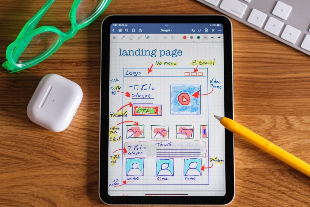
Good SaaS landing pages follow a logic, not just a layout. Hero with a clear value proposition. Social proof close to the fold (logos, user counts, a short quote from a real person). A feature section that frames capabilities as outcomes for the user, not a checklist of what the engineering team built. Pricing or a soft CTA. A final push at the bottom for visitors who scrolled all the way but still have not committed.
Figma’s landing page is worth dissecting here. They layer proof throughout the scroll rather than dumping testimonials in one block. A logo strip early, a case study mid-page, a community size stat near the bottom. That pacing keeps reinforcing trust at each point where a visitor might hesitate.
One thing we notice on nearly every high-converting page: the primary CTA copy is specific. “Start free trial” outperforms “Get started” because it removes ambiguity. Visitors do not want to click a button and discover it leads to a sales call they were not expecting.
How SaaS pages handle pricing (and why most get it wrong)
A common question founders ask us: should the landing page include pricing? The answer is almost always yes, at least directionally. Hiding pricing creates friction and sends qualified buyers to a competitor who was more transparent. You do not need to publish every tier and add-on, but anchoring visitors to a starting price or a free tier removes a significant objection before it forms.
Stripe’s pricing page is the reference here. Clean three-column layout, plain language descriptions, a clear recommendation for who each plan suits. No dark patterns. That clarity is itself a trust signal, which matters enormously when you are asking someone to hand over a credit card.
Should you build your SaaS page on WordPress or something custom?
This comes up constantly. The honest answer is: it depends on what the page needs to do. If the landing page is mostly marketing content with a CTA that points to an app hosted elsewhere, a custom WordPress build is fast to ship, easy for a non-technical founder to update, and solid enough for most SaaS use cases. We have built plenty of them with Elementor Pro and Beaver Builder for exactly this situation.
If the landing page needs to integrate tightly with the product, handle onboarding flows, or do anything transactional, that conversation shifts toward custom web apps territory. The tooling is different, the timeline is longer, and so is the budget. But the fit is better for product-led growth where the line between marketing page and product starts to blur.
Before you start designing, check these boxes
- Your hero states who the product is for and what it does in one sentence, no jargon.
- Social proof appears within the first scroll, not buried below three feature sections.
- Every CTA button says what happens next, not just “Submit” or “Go.”
- The page loads in under three seconds on mobile. Use web.dev/measure to check.
- Pricing is visible or at least anchored, even if it is just “Free plan available, paid from $29/month.”
Speed is not a detail, it is a conversion lever
Google’s own data puts the bounce rate increase at roughly 32 percent when page load time goes from one second to three seconds. For a SaaS landing page running paid traffic, that number is expensive. If you are on WordPress, our WordPress speed optimization service addresses this at the server, asset, and render level. Not with a caching plugin toggle, with actual diagnosis of what is slowing the page down.
The SaaS pages worth emulating are not just well-designed. They are engineered to be fast, clear, and low-friction from the first byte to the signup confirmation. That combination is what separates a page that looks good in a screenshot from one that grows a product.
If you are building or rebuilding a SaaS landing page and want a second set of eyes, we are straightforward to talk to. Book a free 30-minute call and we can scope out what your page actually needs.