How to build a SaaS landing page that actually converts
 Alipio Gabriel
·
·
5 min read
Alipio Gabriel
·
·
5 min read

Most SaaS landing pages fail before the visitor reads the second sentence. Not because the product is bad, but because the page is doing too many things at once and committing to none of them.
We build landing pages for SaaS founders fairly regularly, and the brief is almost always the same: “We need something clean and fast that gets people to sign up.” Simple goal. Surprisingly hard to execute well. Here is what we have learned.
The hero section carries more weight than you think
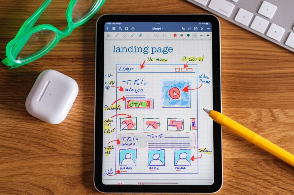
Above the fold, you have roughly five seconds to answer three unspoken questions: What does this do? Who is it for? Why should I care? If your headline is a product tagline written by committee, you have already lost half your visitors.
The headlines that work tend to be embarrassingly direct. “Automate your agency’s client reporting in one click” outperforms “The future of intelligent workflow automation” every time. Lead with the outcome the user gets, not the technology you built. Then let the subheadline handle nuance.
Your CTA in the hero should be singular. One button. On paid tools, that is usually “Start free trial” or “Get early access.” On freemium products, “Sign up free” still converts well. Split testing is worth doing once you have traffic, but do not let the absence of data become a reason to delay shipping something clean.
Social proof placement is a structural decision, not a design detail
Founders often drop their logos bar or testimonials at the very bottom of the page, where exhausted visitors who made it that far are already half-convinced. That is the wrong order. Social proof works best close to the point of friction.
Put a lightweight trust signal (five-star aggregate, a short pull quote, recognizable logos) directly beneath the hero. Then, near the pricing section, repeat a more specific testimonial. One that names a real result: “We cut onboarding time from three weeks to four days.” That specificity is what closes the last bit of hesitation.
How to handle the pricing section on a SaaS landing page
This is one of the questions we get asked most often. Should pricing live on the landing page at all? Generally, yes. Hiding your pricing trains visitors to assume it is expensive. Showing it, even a simplified version, filters for better leads and removes a barrier to signup.
Three tiers is the convention because it works. The middle tier should be visually highlighted and priced so the gap to the top tier feels small. Annual billing deserves a toggle, but default to monthly so the initial number looks lower. If your pricing is usage-based and genuinely hard to display, a calculator widget is worth the build time.
For the technical side of this, we typically reach for a custom WordPress build rather than a template. You get full control over layout, load order, and how Stripe’s payment elements integrate without fighting a page builder’s assumptions. The output is also easier to hand off to whoever owns the site next.
Performance is part of the conversion strategy
A SaaS landing page that loads in four seconds on mobile is leaving signups on the table. Google’s own data puts the probability of bounce increasing sharply after three seconds, and a page selling software to professionals will be judged harder than a brochure site. Perceived speed is trust.
On the builds we ship, we keep hero images under 100 KB (WebP, properly sized), defer anything that is not critical to first paint, and avoid loading third-party scripts synchronously. Analytics, chat widgets, heatmap tools: all of them should load after the main content. Our WordPress speed optimization work follows the same priorities we apply to landing pages specifically.
Before you hand this off to anyone, run through this
- Hero headline states the user’s outcome, not your product’s feature set.
- Single CTA above the fold, repeated at the bottom of the page.
- Social proof appears near the hero and again near pricing, not only at the footer.
- Pricing is visible and has a highlighted recommended tier.
- Largest Contentful Paint under 2.5 seconds on a mid-range mobile connection.
None of these are controversial. They are just easy to skip when the deadline is close and the product demo video is still being recorded.
What tech stack makes sense for a SaaS landing page
If you need deep customization, fast iteration, and a CMS your non-technical co-founder can update, WordPress is still the right answer for most SaaS landing pages. If the page will eventually grow into a marketing site with a blog, documentation section, and localized variants, that argument gets even stronger.
For more complex product requirements, like in-app dashboards or user portals built into the same domain, we sometimes shift into custom web apps territory. That conversation usually starts with scope: what does the authenticated side of the product need to do, and does WordPress’s architecture serve it or fight it?
If you are scoping a SaaS landing page and want a second opinion on the approach, we are happy to talk through it. Book a free 30-minute call and bring whatever you have, wireframe, Figma file, or just a list of questions.