How to build a SaaS feature page that actually converts
 Alipio Gabriel
·
·
4 min read
Alipio Gabriel
·
·
4 min read

Most SaaS feature pages fail the same way: they list capabilities instead of explaining outcomes. A visitor lands on the page, reads six bullet points about “robust integrations” and “seamless workflows,” and leaves with no clearer idea of why they should pay for the thing. We’ve rebuilt enough of these to recognize the pattern fast.
The structure that actually holds a reader’s attention
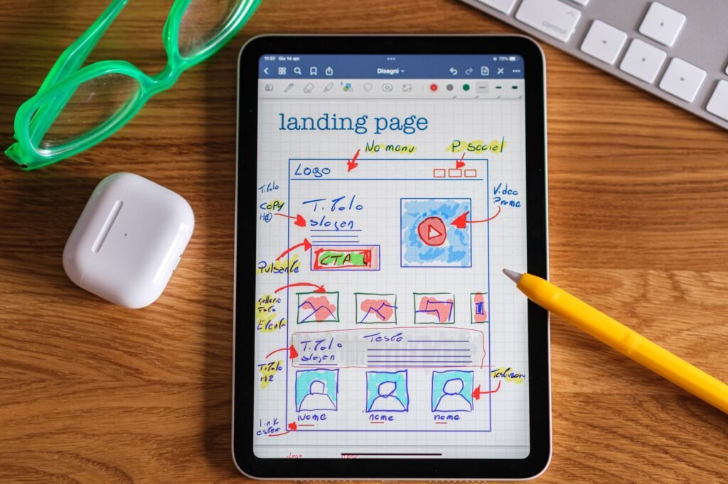
A SaaS feature page is not a spec sheet. The hierarchy that works goes: named outcome first, mechanism second, proof third. Lead with what the user gets (“Your team ships reports in minutes, not hours”), then explain how the feature delivers it, then show a screenshot or a real customer quote. That order matters. Reversing it buries the value under jargon.
Above the fold, you need a headline that names a specific problem or result, a subhead that fills in the “how,” and a primary CTA. One CTA. Not three. We default to a free trial or a demo request depending on the product’s sales motion, and we make sure the button copy isn’t “Submit.”
Sections that earn their scroll depth
Below the fold, each feature block should answer one question: so what? A two-column layout works well here. Image or short video loop on one side, tight benefit copy on the other. Alternate the alignment every two or three blocks so the page doesn’t feel like a PowerPoint deck. Keep copy to three or four lines per block. If you need a paragraph to explain a feature, the feature probably needs a better name, not more words.
Social proof belongs closer to the top than most founders expect. A strip of recognizable logos, or a single sharp customer quote with a real name and company, placed right after the hero section, handles more objection work than any feature list below it. We’ve seen conversion rates shift noticeably just from repositioning this element.
FAQs have a place near the bottom, but keep them to genuine blockers: pricing confusion, security questions, integration limits. Don’t pad the section with questions nobody asks.
The technical side most teams underestimate
Page speed is not optional on a SaaS feature page. Prospective customers evaluating your product are also, consciously or not, evaluating your ability to build software. A feature page that loads in four seconds on mobile is a quiet argument against signing up. We run WordPress speed optimization as a dedicated engagement for exactly this reason: Core Web Vitals scores show up in demos and sales calls more than people expect.
If the page lives inside a WordPress-powered marketing site, the builder choice matters. Elementor Pro and Beaver Builder both handle feature page layouts cleanly, but they require deliberate asset management to stay fast. Raw Gutenberg with a lean block theme is our preferred starting point for performance-sensitive SaaS sites these days. For more complex interactive demos or gated feature walkthroughs, we sometimes move those into custom web apps separate from the marketing layer entirely.
Before you call the page done: a short checklist
- The headline names an outcome, not a category (“reporting” is a category; “cut report prep from two hours to ten minutes” is an outcome).
- Every feature block answers “so what” before describing the mechanism.
- There is one primary CTA above the fold and it uses specific button copy.
- Social proof appears within the first two screen-lengths, not at the bottom.
- The page scores green on Largest Contentful Paint in PageSpeed Insights on mobile.
Is a dedicated feature page better than a features section on the homepage?
For early-stage products with one core use case, a long homepage with a features section can be enough. Once you have two or three distinct buyer personas, or once you’re running paid campaigns to specific features, dedicated pages pay off. They let you tailor the headline and proof to the exact problem that persona searched for, and they give SEO something to work with. A generic “/features” URL targeting the word “features” is not a strategy.
We cover this kind of structural thinking in our SEO and technical audits, where site architecture and conversion intent get looked at together rather than in separate silos. The audit often turns up feature pages that exist but aren’t indexed, or pages that are indexed but targeting the wrong term entirely.
The best SaaS feature pages we’ve built share one trait: the team knew exactly who they were talking to before a single word was written. If you’re starting from scratch or reworking a page that isn’t converting, book a free 30-minute call and we can look at what you have and where the gap is.