A patient searching for a doctor on their lunch break has about thirty seconds of patience. If your phone number isn’t tappable on the first screen, or the booking button is buried below three paragraphs of credentials, they close the tab and call someone else. That’s not a hypothetical. It’s the pattern we see every time we do a mobile review of a practice website.
Good medical practice website design solves one problem above everything else: a patient on a phone should be able to call or request an appointment without scrolling, zooming, or squinting. The rest of this post tells you exactly how to check whether your site does that, and what to fix when it doesn’t.
Pull up your site on a real phone right now
Open your website on your personal phone, not in a desktop browser’s “mobile view.” Actual devices render differently, and you want to see what your patients see. Keep a note app open and work through the checks below. This takes about ten minutes.
The first thing to look for: is your phone number visible without scrolling? Not in a footer link. Not in a “Contact” page. On the first screen, in the header or as a sticky bar, with a tel: link so tapping it opens the dialer. If you have to scroll to find it, you’ve already lost a chunk of callers.
Second: is there a “Book appointment” or “Request a visit” button in that same first screen? One button, high contrast, big enough to tap without pinching. If your booking flow lives inside a patient portal that opens in an external app, that’s fine, but the entry point needs to be obvious from the moment the page loads.
The five gaps that cost practices the most patients
When we review practice websites on mobile, the same misses come up repeatedly. For the practices we work with, including a urology practice and a cancer care practice you can read about in our case studies, these five are the ones that actually block conversions:
- No tap-to-call link on the first screen. The number is there, but it’s plain text. On mobile, plain text numbers don’t open the dialer. Wrap it:
<a href="tel:+15551234567">(555) 123-4567</a>. - No clear appointment button above the fold. A sticky header with one CTA button solves this permanently.
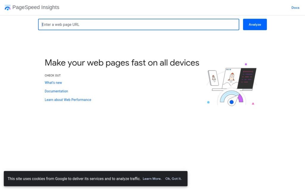
- Slow mobile loading. Run your URL through PageSpeed Insights and look at the Mobile score. Below 50 means patients are staring at a white screen. Images that weren’t compressed, and plugins that load scripts they don’t need, are the usual culprits.
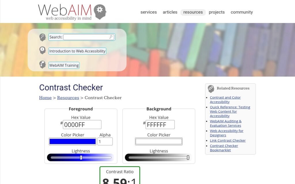
- Low colour contrast. Light grey text on a white background might look refined on a desktop in a dim office. On a phone in sunlight, it’s invisible. The WCAG standard for normal text is a contrast ratio of at least 4.5:1. Use the WebAIM Contrast Checker on your primary text and button colours.
- No medical structured data. Schema markup (specifically
PhysicianorMedicalClinicfrom Schema.org) tells Google exactly what your practice is, where it is, and what it treats. Without it, you’re leaving local search visibility on the table.
Can you fix these yourself?
Some of them, yes. The tap-to-call link is a one-line HTML edit. If your site runs on WordPress with a page builder like Elementor or Beaver Builder, you can usually find the header phone number widget and add the tel: link through the builder’s link field. Same for button contrast: most builders expose a colour picker for button backgrounds and labels, so you can adjust until the WebAIM checker is happy.
Slow loading is trickier. Installing a caching plugin like WP Rocket and running images through a compression tool like ShortPixel will recover a lot of speed, but if your theme is bloated or your hosting is shared and undersized, you’ll hit a ceiling. That’s the point where a proper technical audit pays for itself, because it tells you exactly which files are the problem rather than having you guess.
Structured data is the one we’d recommend getting help with. The markup needs to be accurate (wrong address or phone number in schema causes more harm than no schema), and it needs to validate against Google’s requirements. We handle this as part of our standard setup when we build websites for doctors, but if your existing site is otherwise solid, it may be worth having someone add and test it rather than rebuilding.
How to confirm the fixes actually worked
After making changes, do three checks before you call it done.
- Tap-to-call: Open the page on your phone and tap the number. It should prompt the phone’s dialer with the number pre-filled. If it doesn’t, the link attribute is missing or malformed.
- PageSpeed: Re-run PageSpeed Insights on mobile after any speed changes. Give it a few minutes after clearing your cache first. You want the Largest Contentful Paint (LCP) under 2.5 seconds and a score above 70 as a working target.
- Structured data: Paste your URL into Google’s Rich Results Test (search “Rich Results Test” and use the tool at search.google.com). It will tell you whether Google can read your schema and flag any errors.
What good medical practice website design looks like in practice
Put it together and the mobile experience should feel nearly frictionless: the patient lands on the page, sees the practice name and specialty, sees a phone number they can tap and a button to request an appointment, and can find office hours without scrolling past the fold on a standard phone screen. Everything below that point, the physician bios, insurance information, patient portal link, earns its place but doesn’t block the primary action.
That’s the standard we hold ourselves to when we do WordPress design and build for practice clients. It’s also the standard your existing site can be measured against in the ten-minute check above, regardless of who built it or when.
If you run through the list and find more than two of those five gaps, it’s probably worth a conversation. We offer a free 30-minute call with no sales pressure, and we can usually tell you in that time whether a targeted fix or a fuller rebuild makes more sense for your situation. Reach out through our contact page and we’ll go from there.